Show how you actually build.
Your tools, in the order you really use them, with the reasoning attached. Buildscape turns that into a map you can publish, share, animate and let other people copy. An afternoon to make. Years of use.
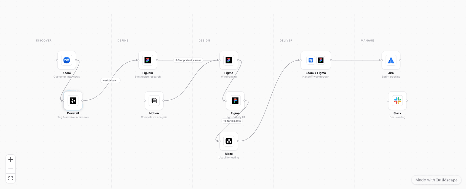
A live canvas, not a picture — the same read-only view a visitor gets on a published workflow. Ten steps across five stages; every tile is a tool someone actually uses.
Three reasons this is worth an afternoon.
Your best work has nowhere to go.
The process is the scarce part.
You explain it every week anyway.
The thing that stops most people publishing isn't effort or polish. It's the assumption that nobody cares about the process behind the work.
The counter on your own page is the only thing that settles that argument.
Four moves. That's the whole editor.
No blank-canvas anxiety, no diagramming skill required. A node is a tool doing a thing. An arrow is what moves between them. Lanes are your stages.
Drop a node for each tool.
Every node carries a real tool with its real logo and a short line for what you do with it. Two tools in one step? Put both on the node — that's how the work actually happens.
Say why, not just what.
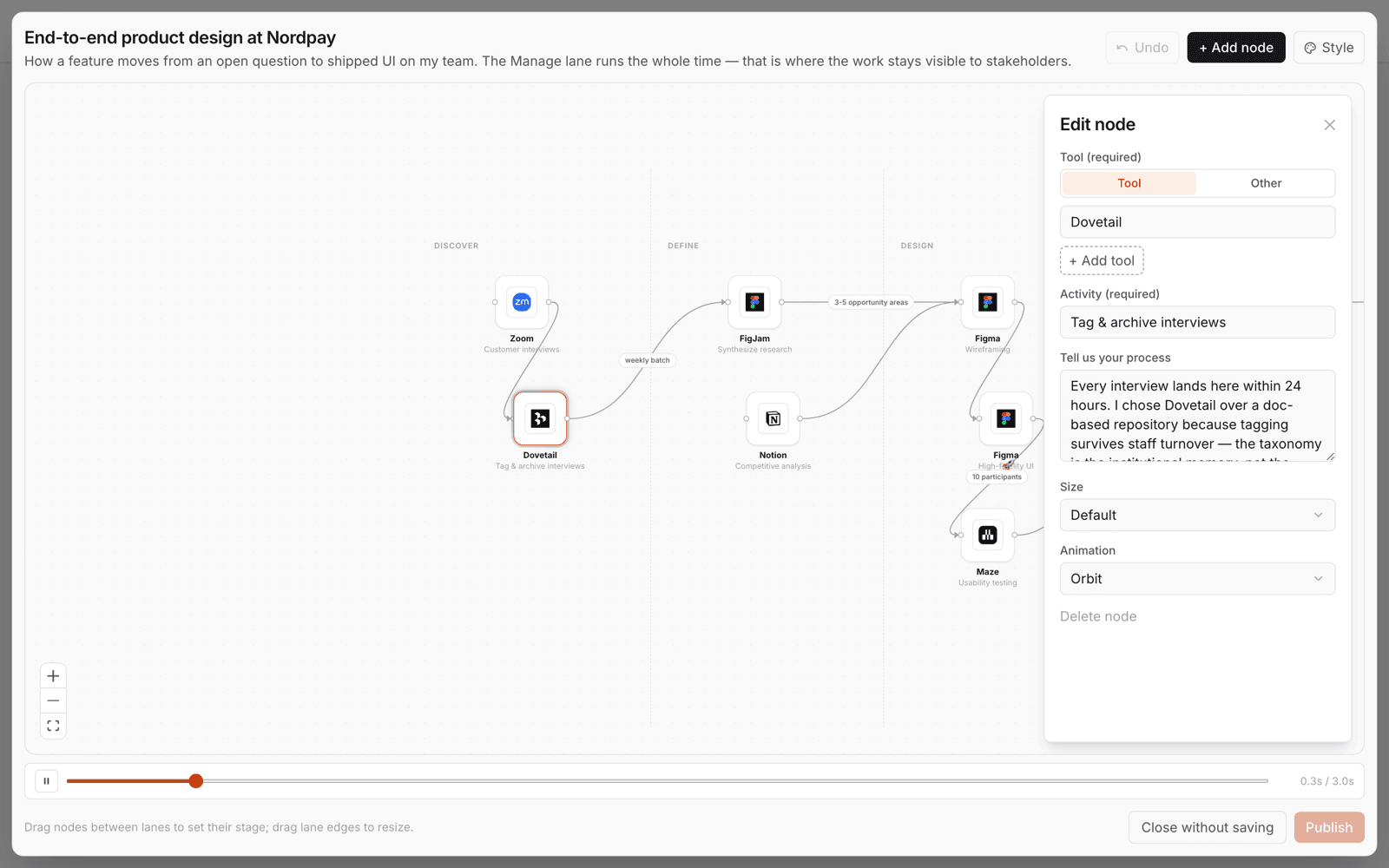
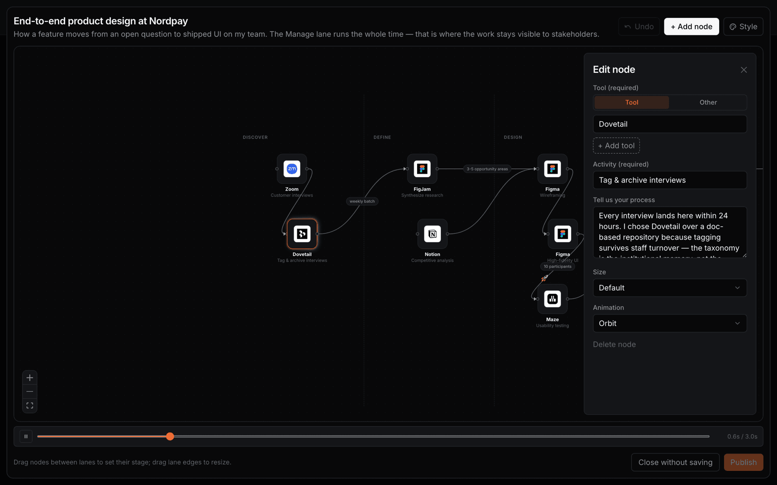
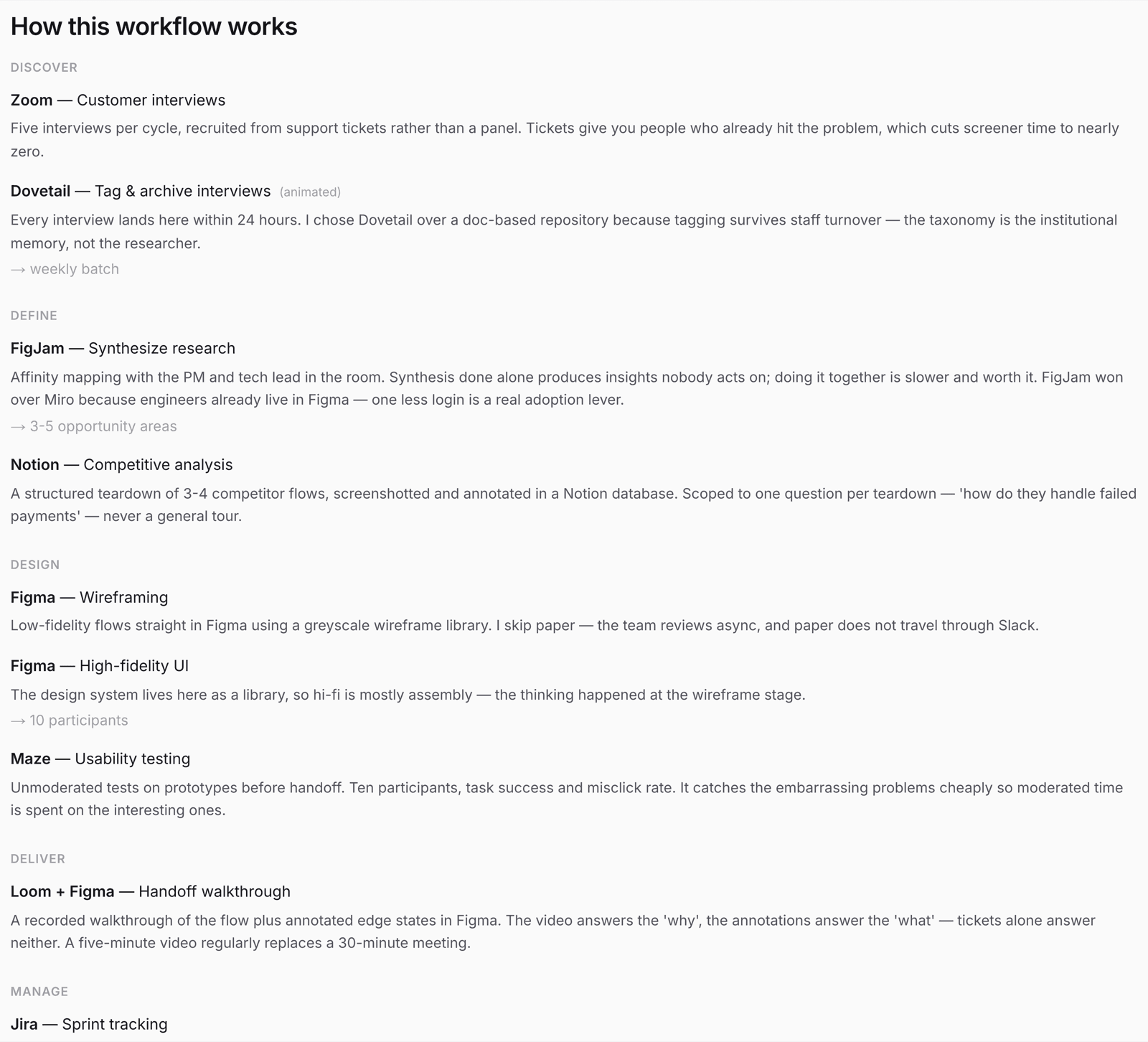
“Tell us your process” is the field that makes the whole thing worth reading — why this tool won, what you tried first, what you'd cut next time. It's also the part nobody else publishes.
Drag it into shape.
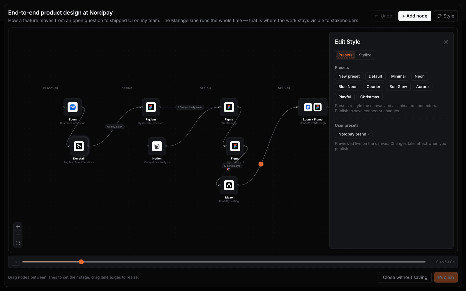
Drag nodes between lanes to set their stage; drag the lane edges to resize. Name the lanes whatever your process actually calls them — Discover/Define/Design, or Spot/Validate/Build/Ship/Learn. There's an undo.
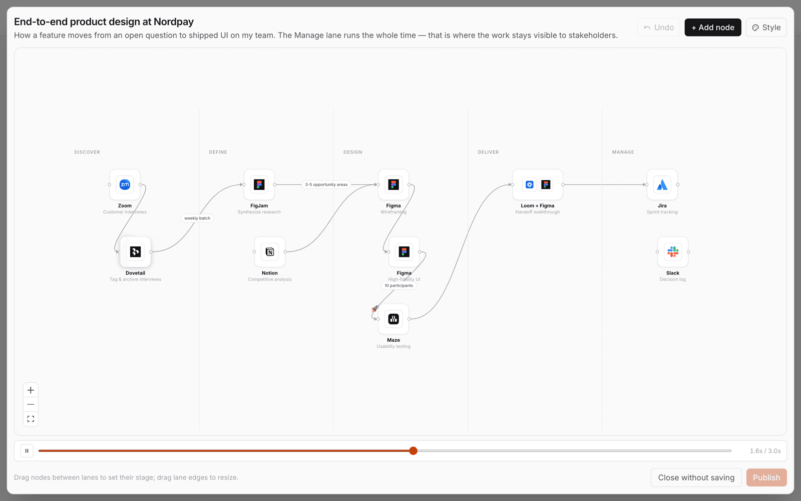
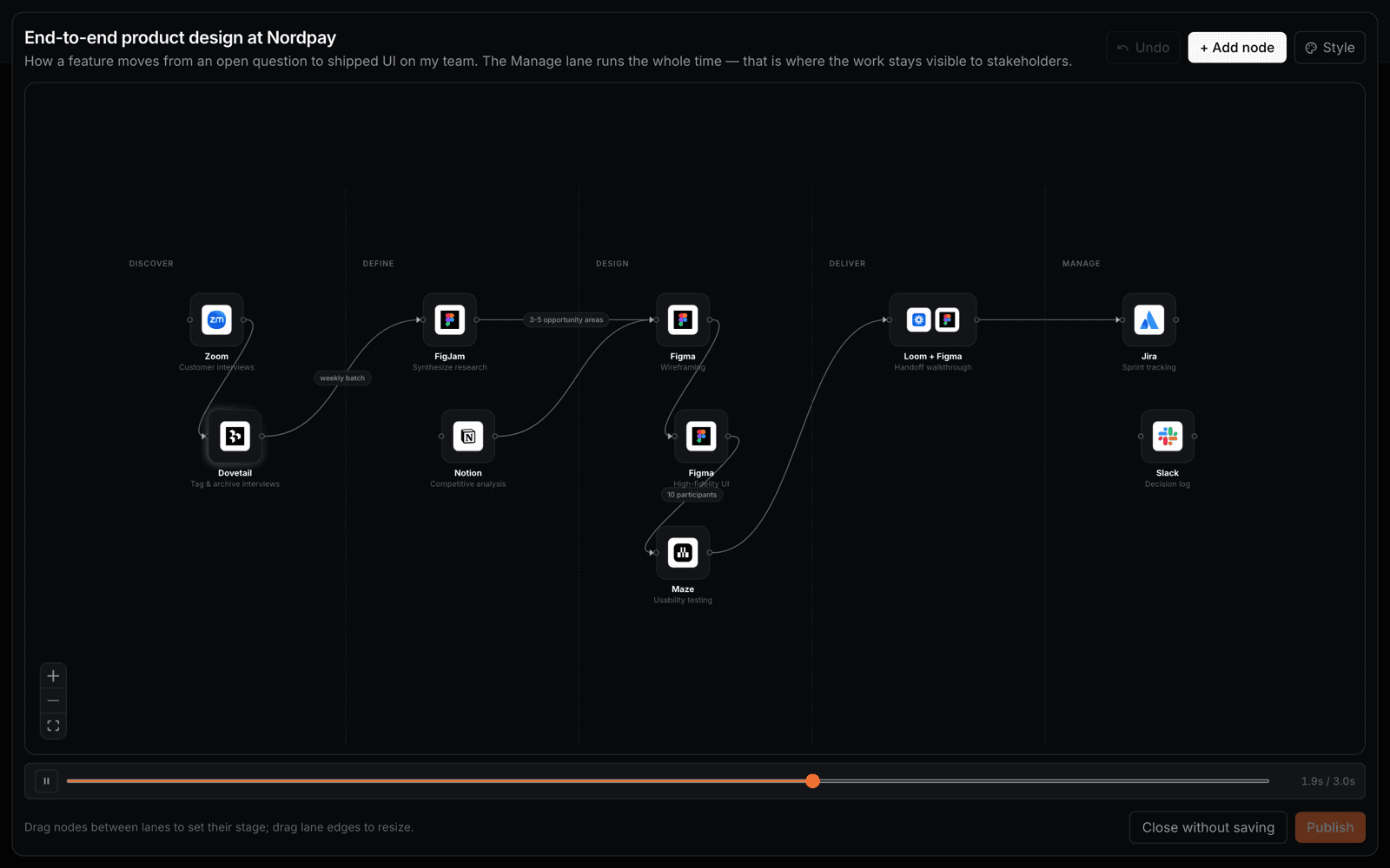
Publish when you mean it.
Everything you change is a draft until you hit Publish — styling included. Close without saving and the map goes back exactly as it was. Keep it private while it's ugly; nobody sees a draft.
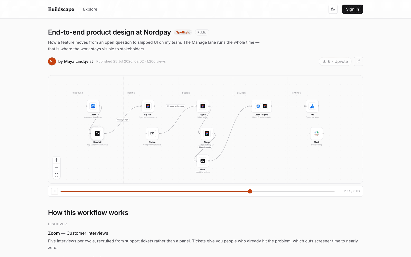
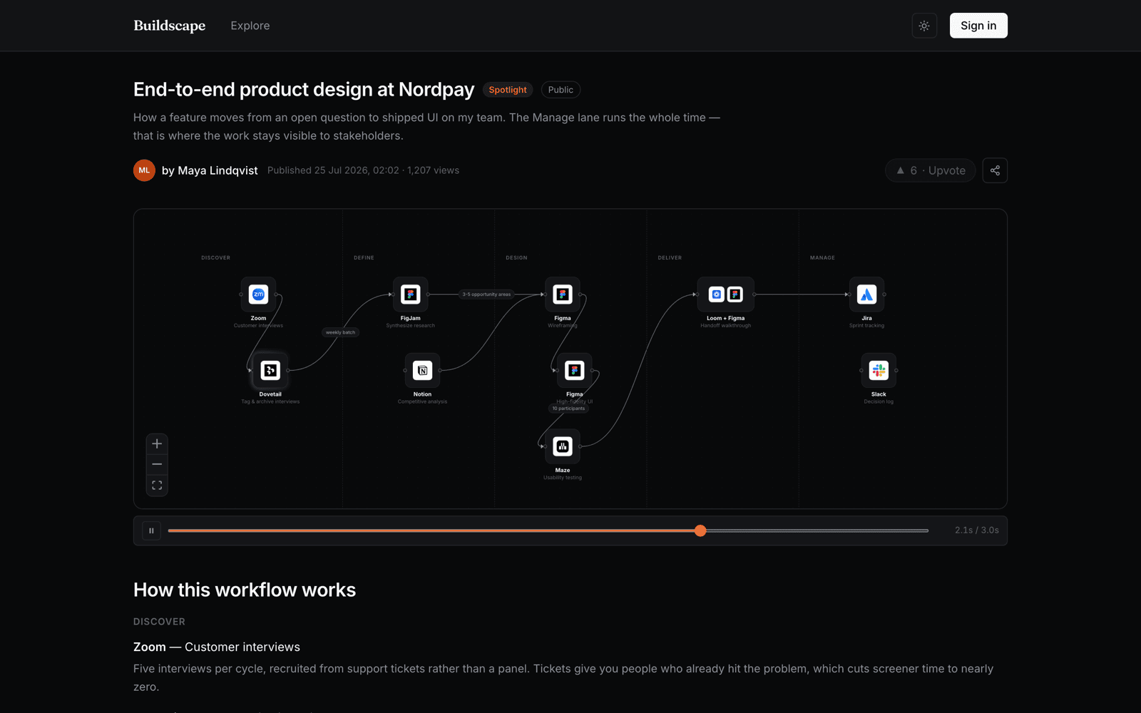
The map is the point. Everything else serves it.
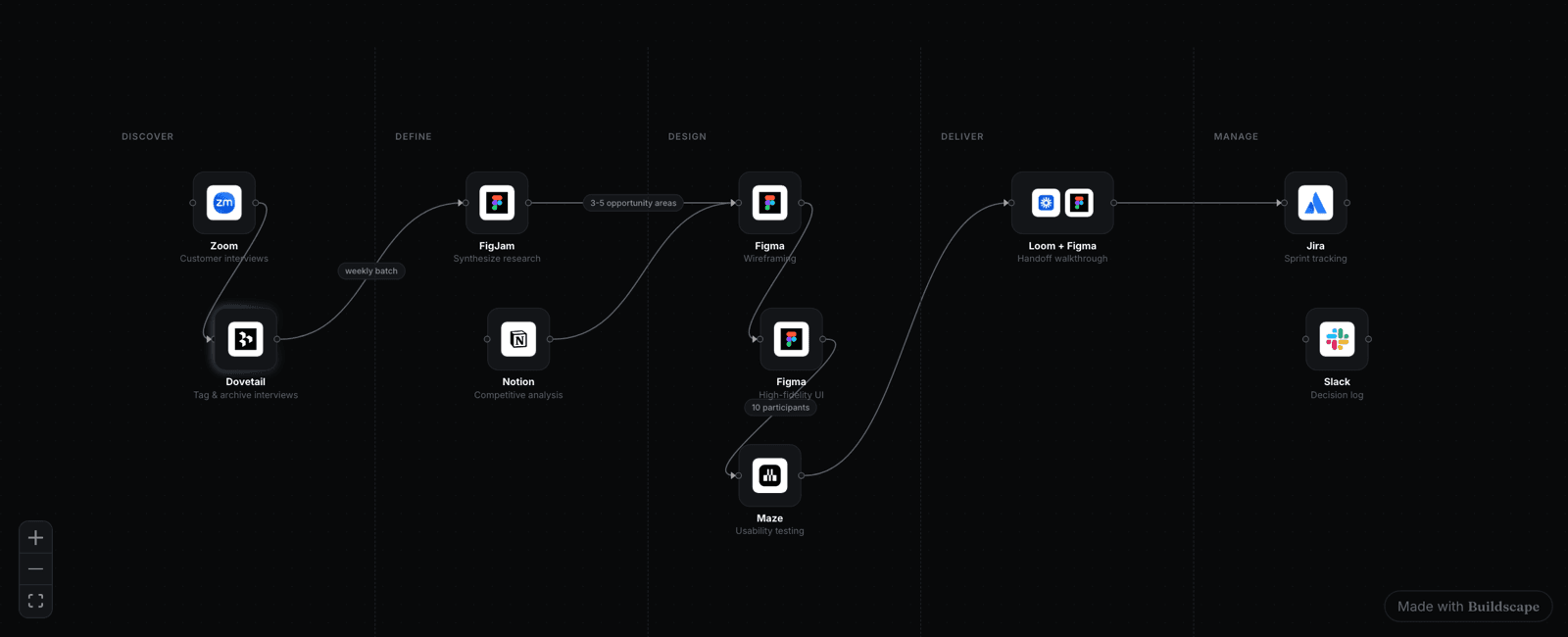
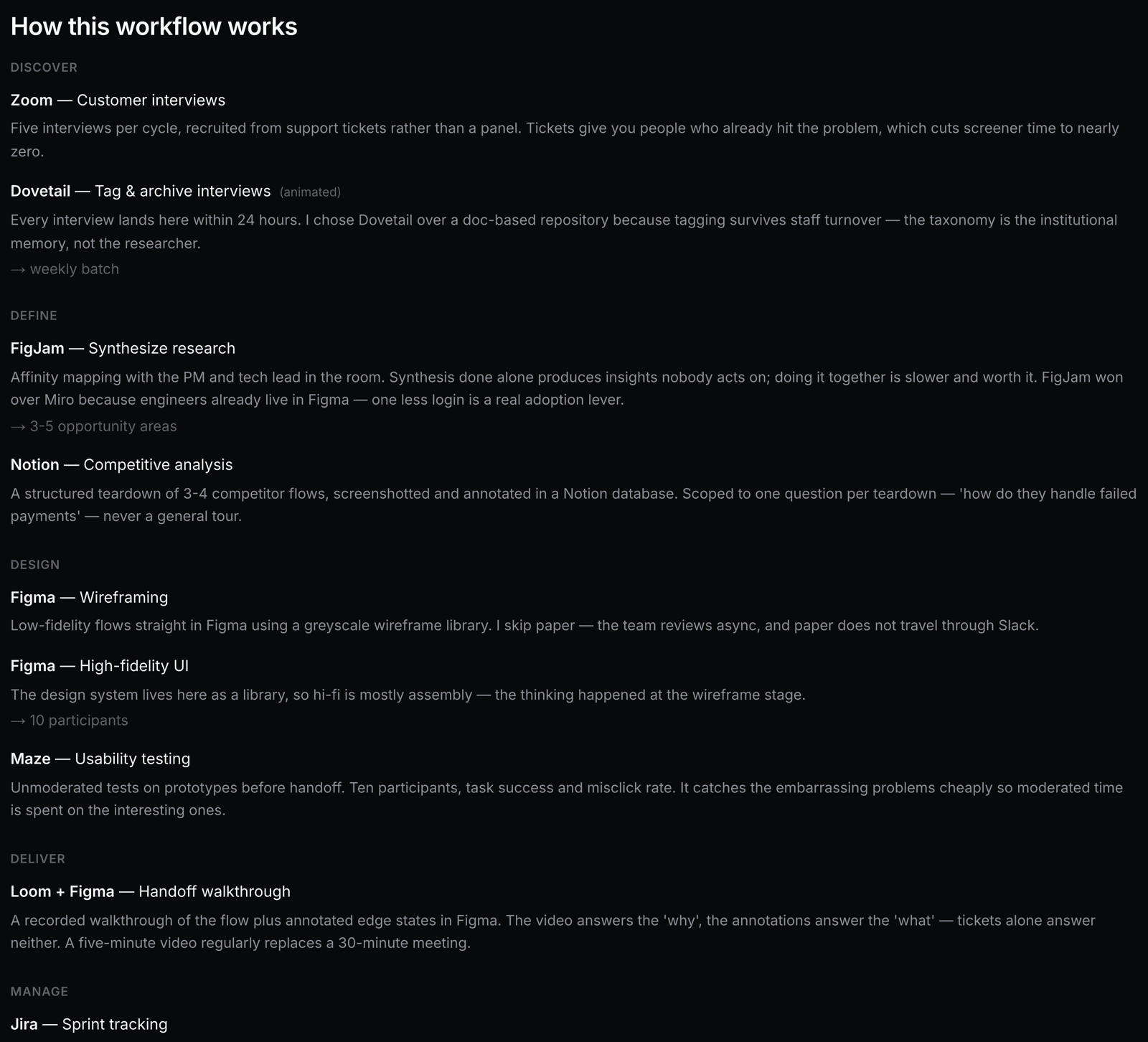
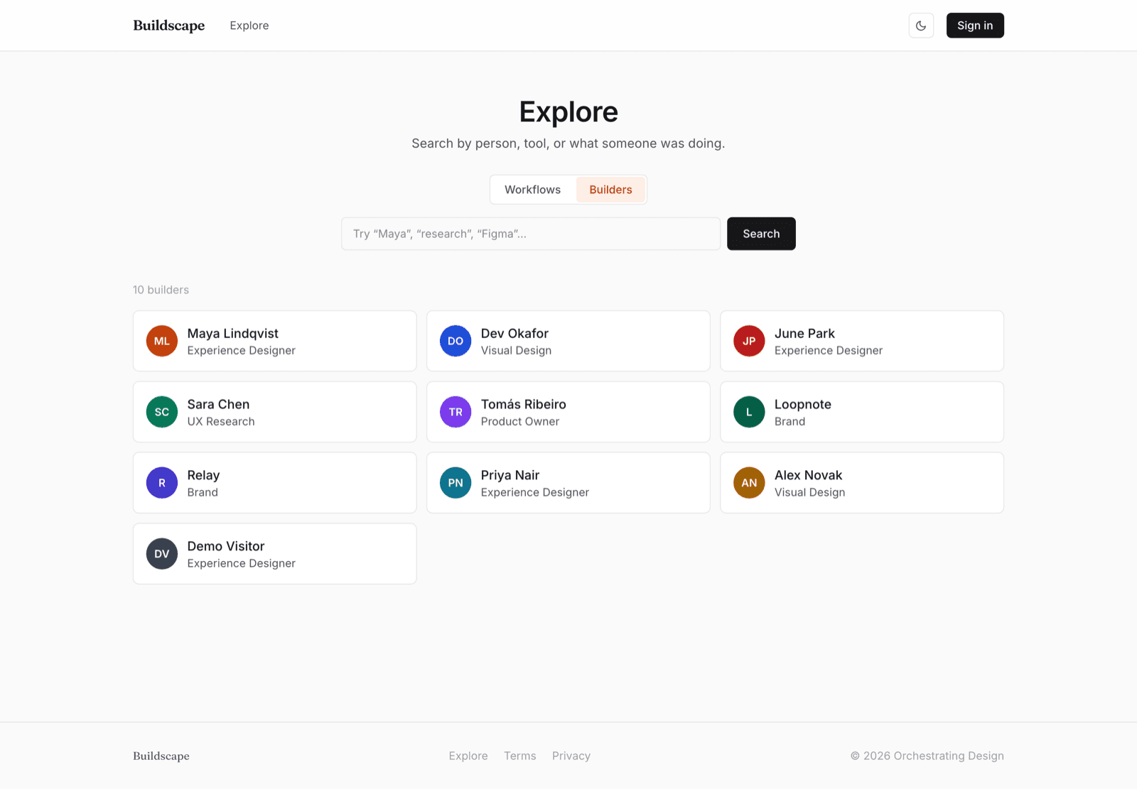
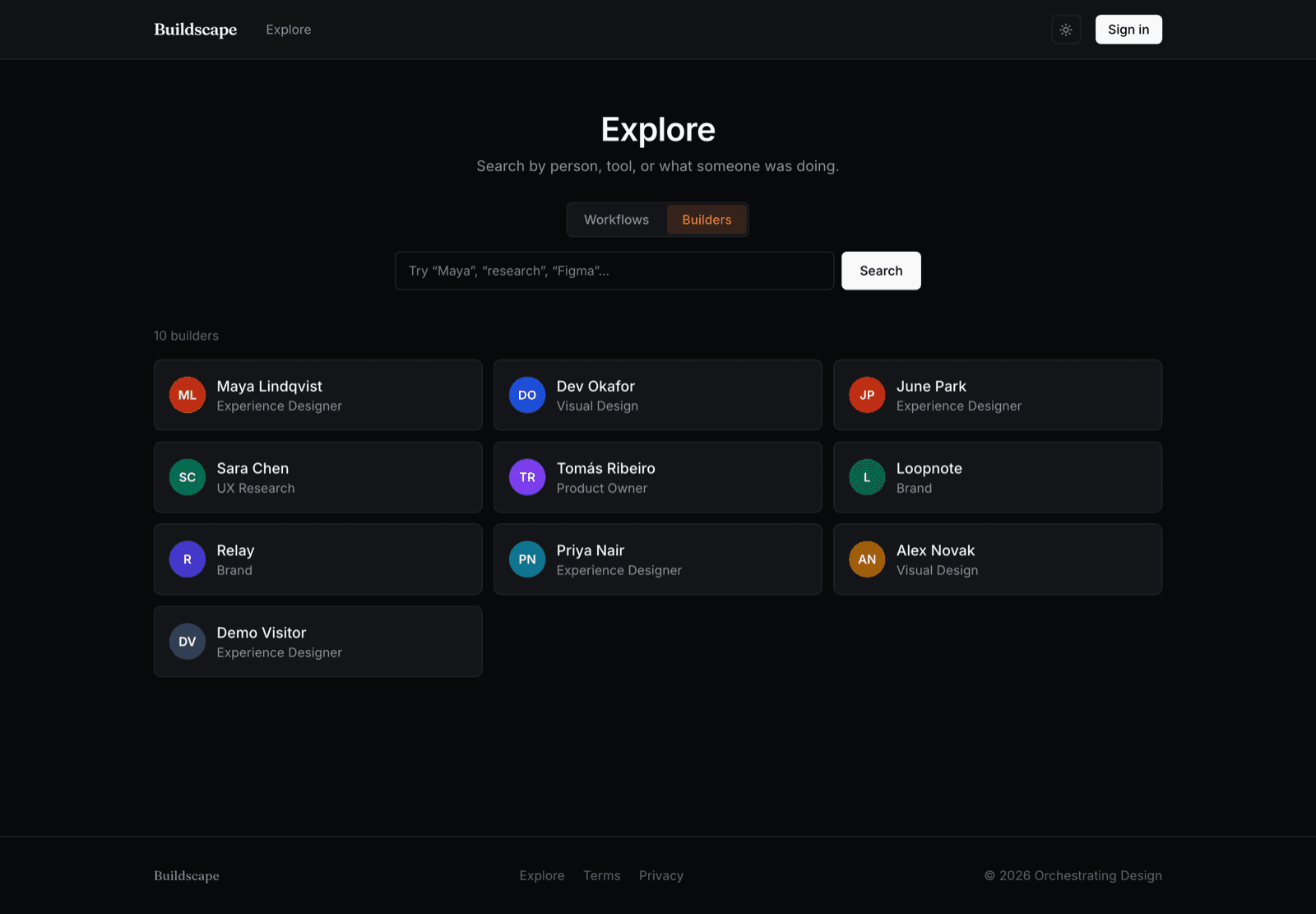
It reads at a glance and it holds up close. Light and dark are equals, not a theme afterthought, so it looks right wherever you paste it.
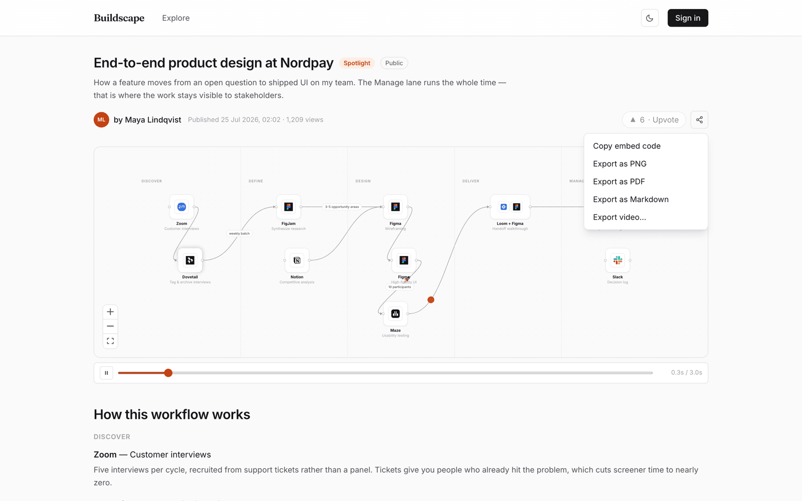
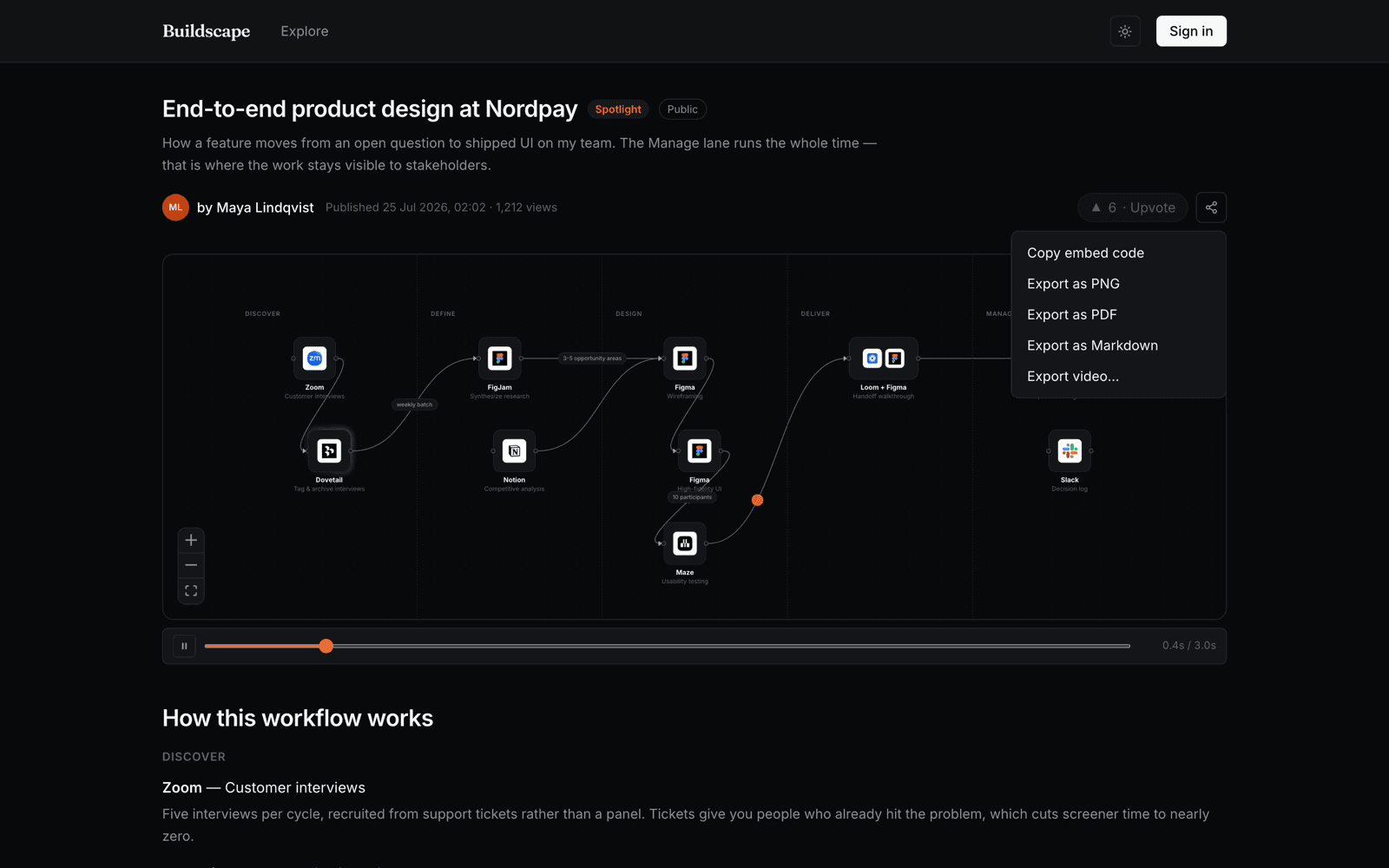
Your tools, credited properly.
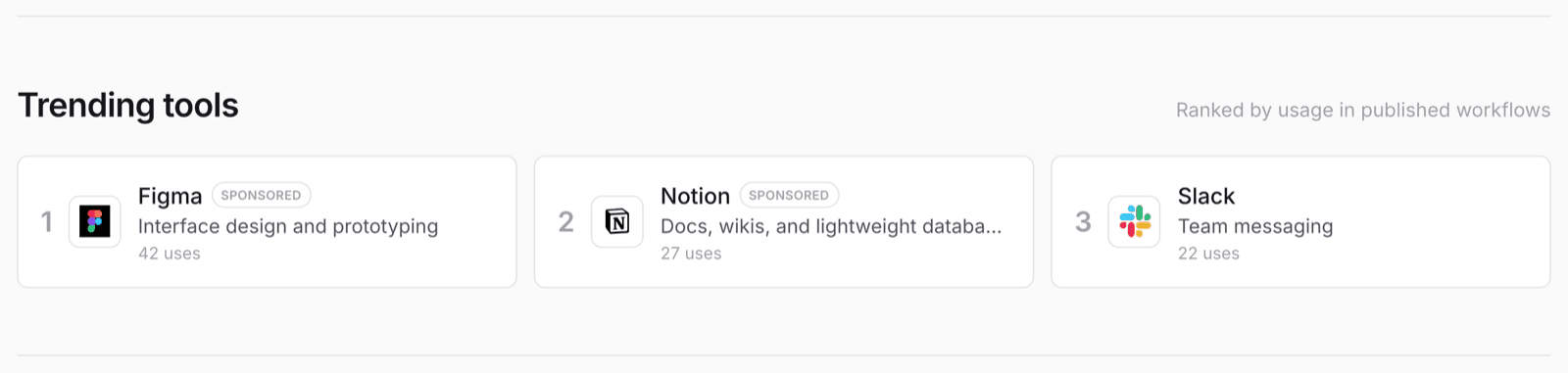
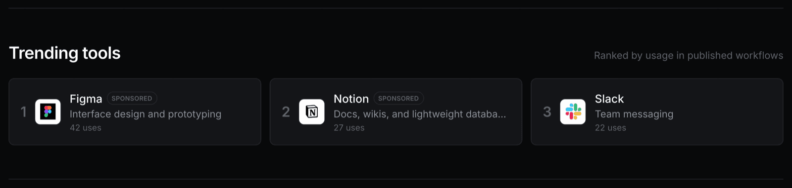
Every tool you place is a real, linked entry — not a text label. Readers can see what you use, click through, and find every other workflow it appears in. If you build with something obscure and good, this is how people find out about it.
The ranking is a usage count: how often builders actually place a tool in a published workflow. Sponsors can buy a slot, and when they do it says Sponsored on it. The number underneath is still the real one.
Give the thing a pulse.
A static diagram says “documentation”. A moving one says “this runs every week”. Work travels along your connectors; the steps you want noticed glow, orbit, pulse or throw confetti.
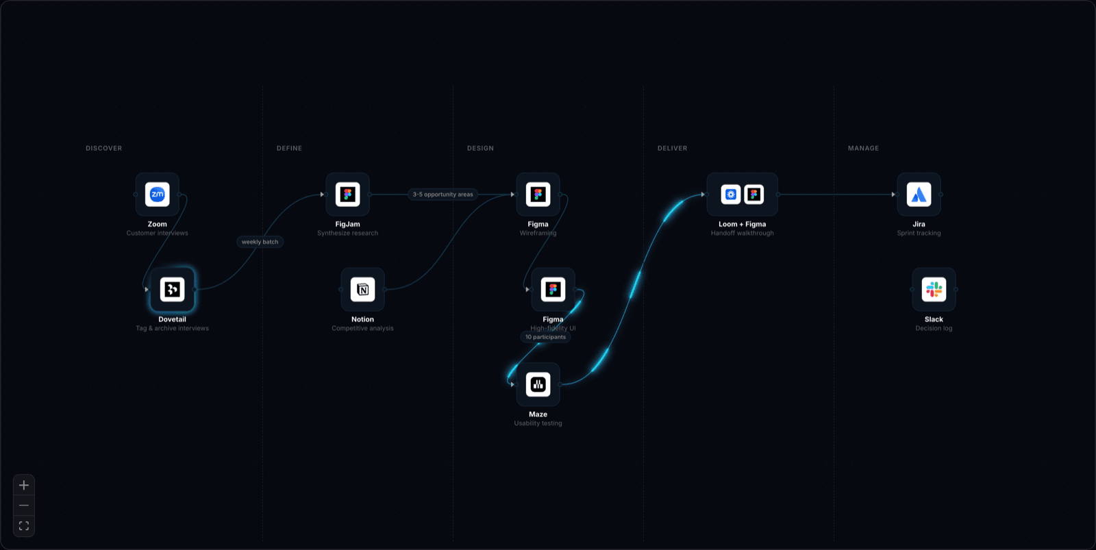
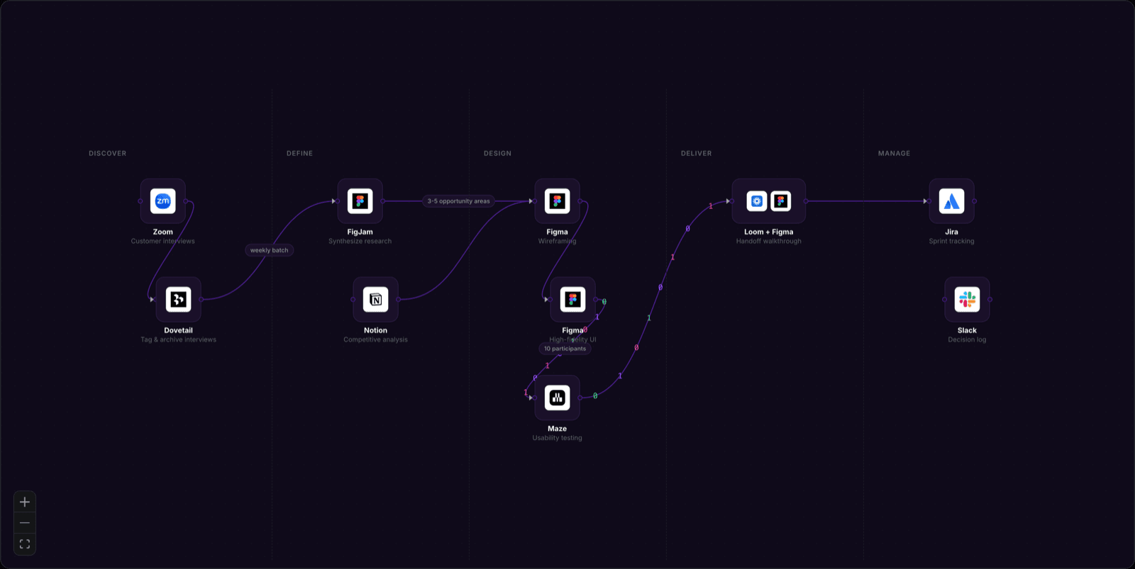
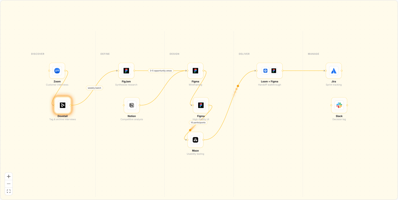
One click to restyle, or every dial if you want it.
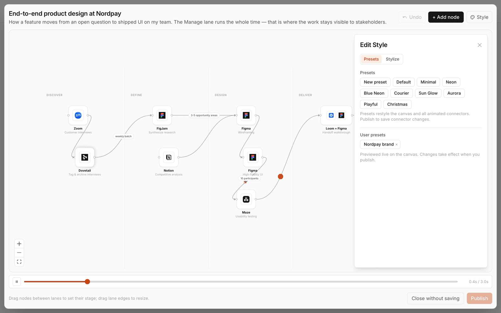
Presets restyle the canvas and every animated connector at once. Underneath, the Stylize tab exposes the lot — node background, border, corner radius, connector colour and weight, three animation colours, label sizes, lane dividers.
And because the whole thing compiles to one deterministic timeline, Export video hands you a file to post: the same map, moving, with no screen recording involved.
Where the model actually sits in your work.
Not “we use AI”. Which model, at which step, doing what — and what you still do yourself. AI tools are first-class nodes with their own logos, and any step can be set to glow, orbit or pulse. Most authors use that to mark exactly where the model earns its place.
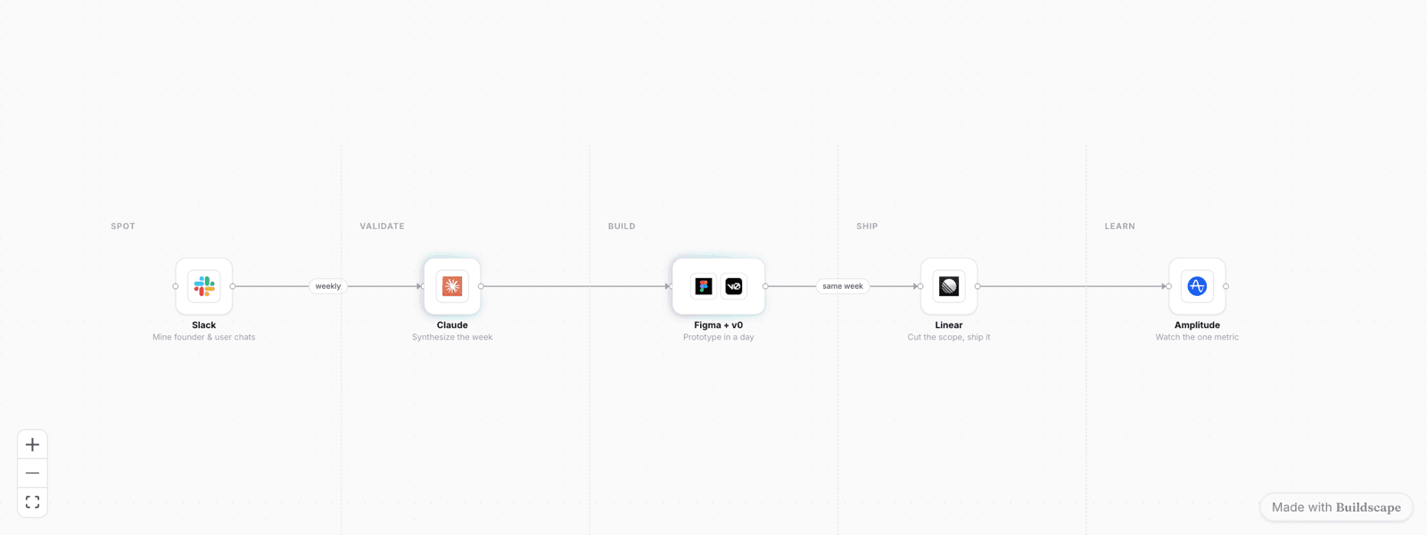
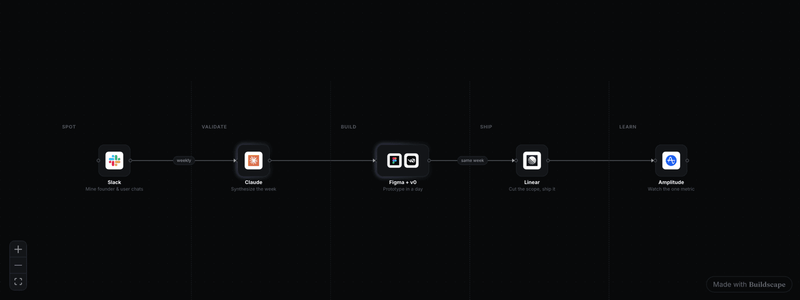
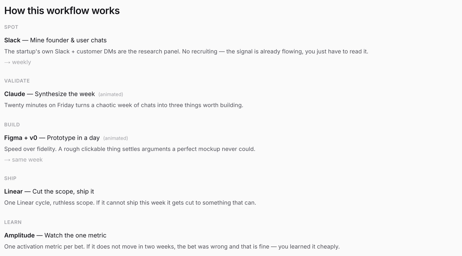
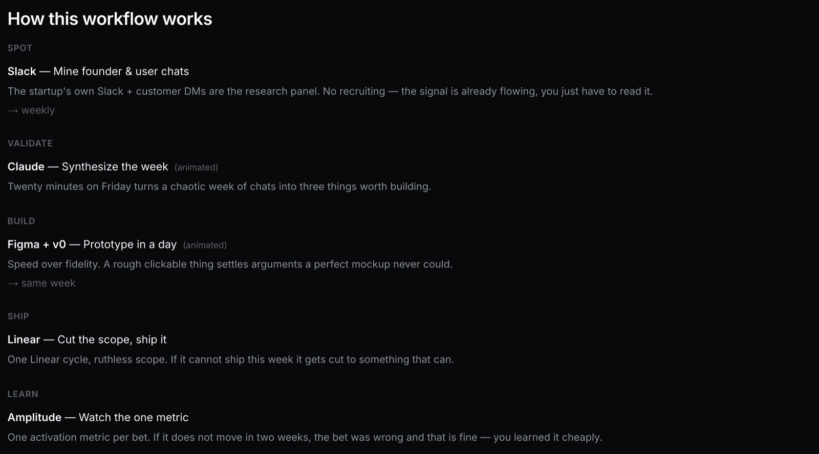
A page that answers “how do you work?” for you.
Your handle, your maps, your links out. One workflow in the spotlight, the rest grouped into collections you name. Private ones stay private — the in-progress experiment nobody needs to see yet still lives here.
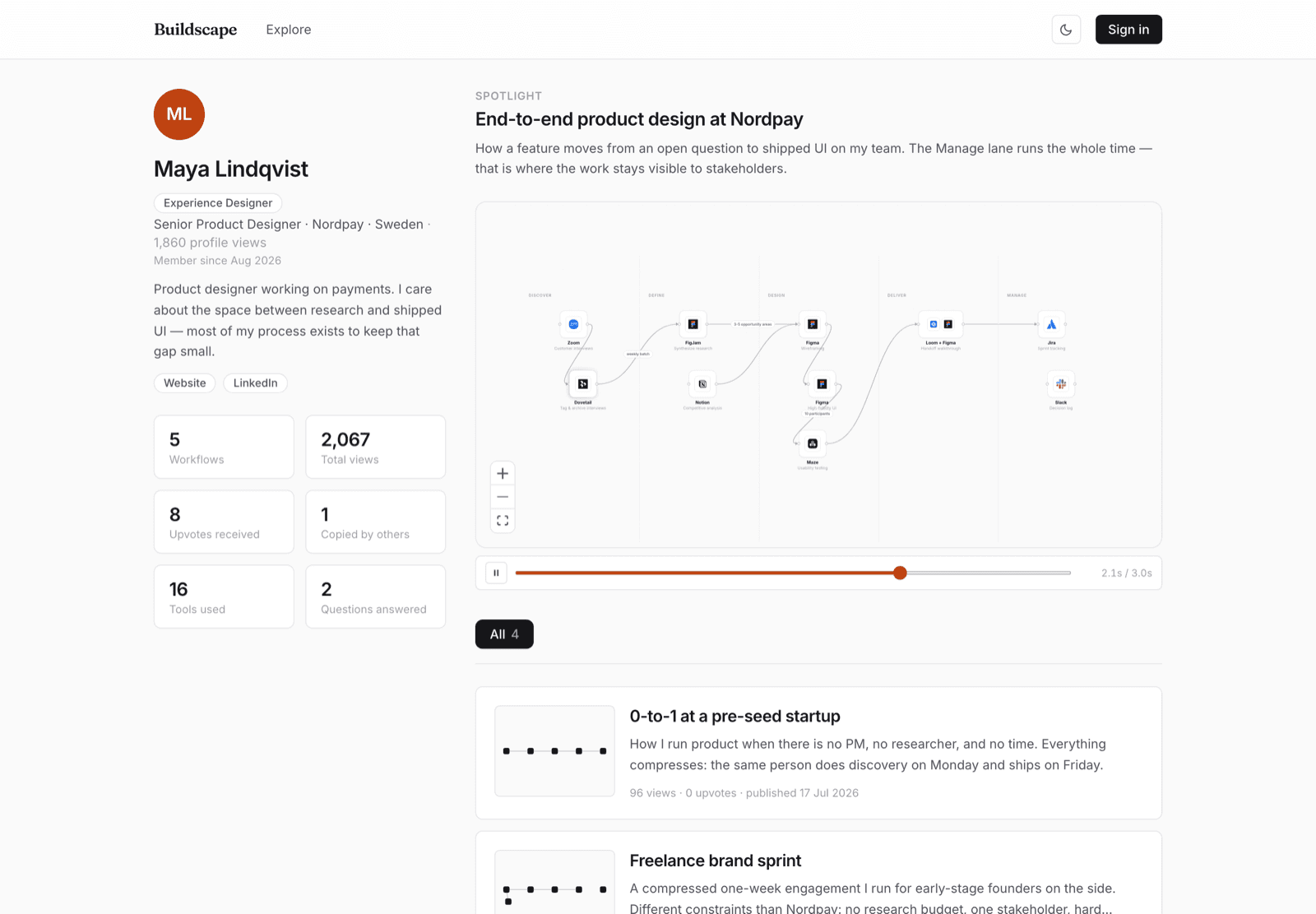
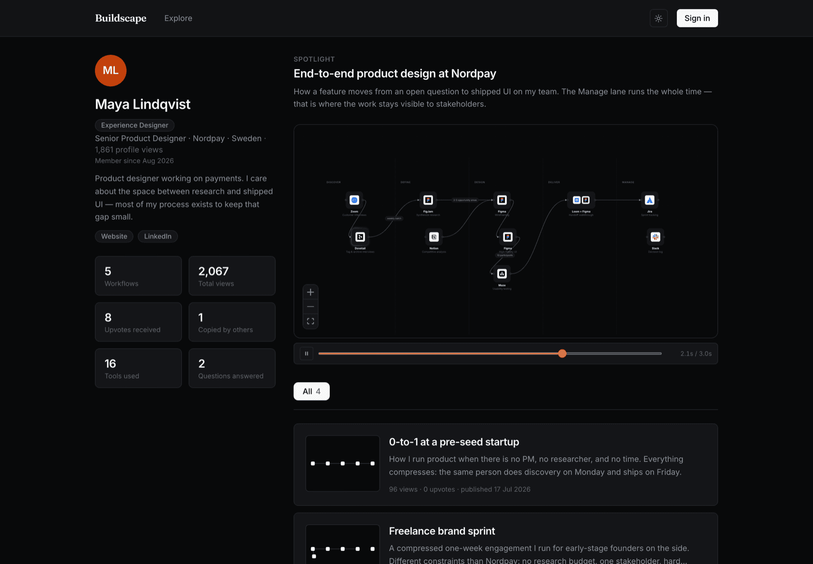
Made for work in progress.
Anyone can take it and adapt it.
People turn up, and you can tell who.
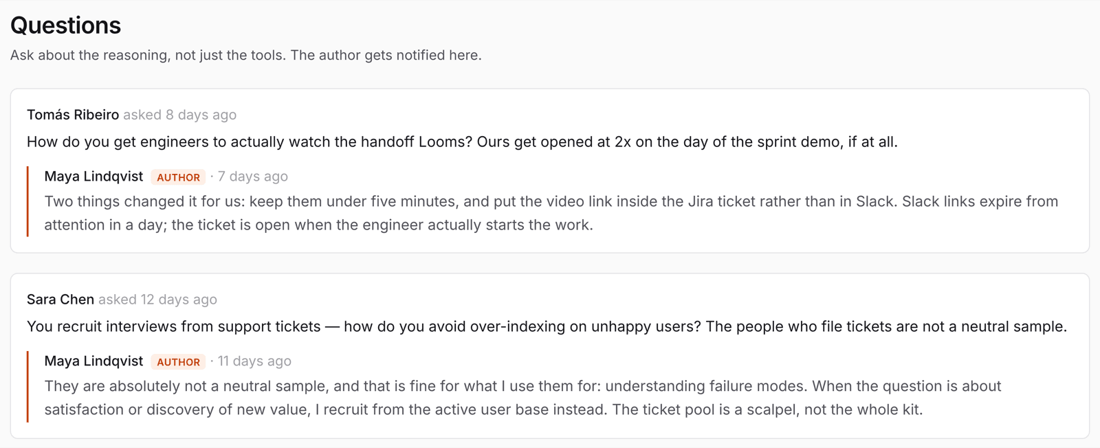
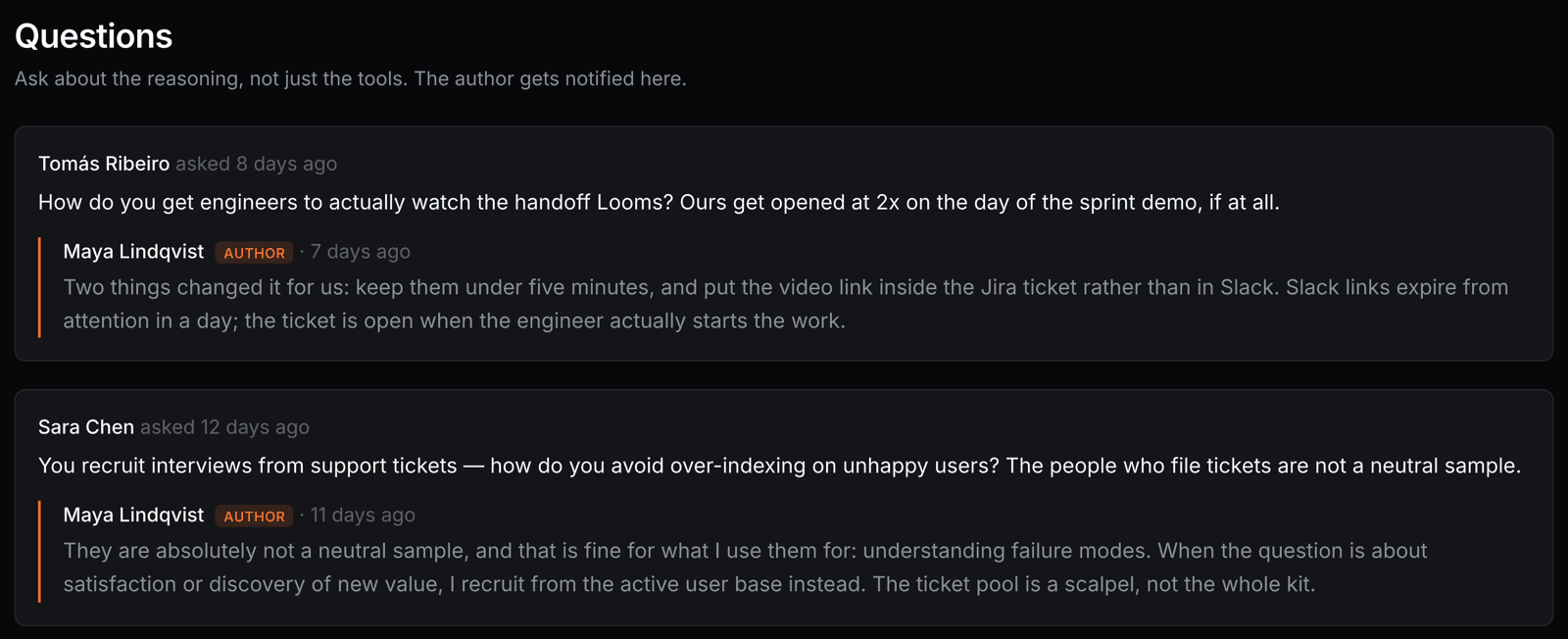
Upvotes, copies, and questions from named people with real jobs — asked on your page, answered in your voice, with your reply marked AUTHOR. That thread is often better than the workflow it hangs off.
Findable by the people looking for exactly you.
“Who here actually ships with v0” is one query, not a week of scrolling. Good maps get spotlighted on the homepage.
Following a builder, and a feed of their new work. Today people find you through Explore, the homepage, and wherever you embedded your canvas — there's no follow button yet.
Numbers you can act on, not a vanity dashboard.
Every map you publish is dated. Put out four across a year and the drift is the interesting bit: the tool you dropped, the step that collapsed into one, the manual thing a model now does.


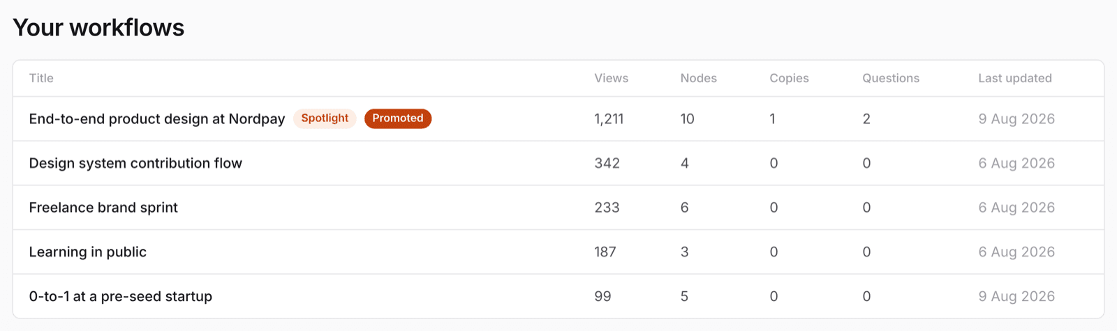
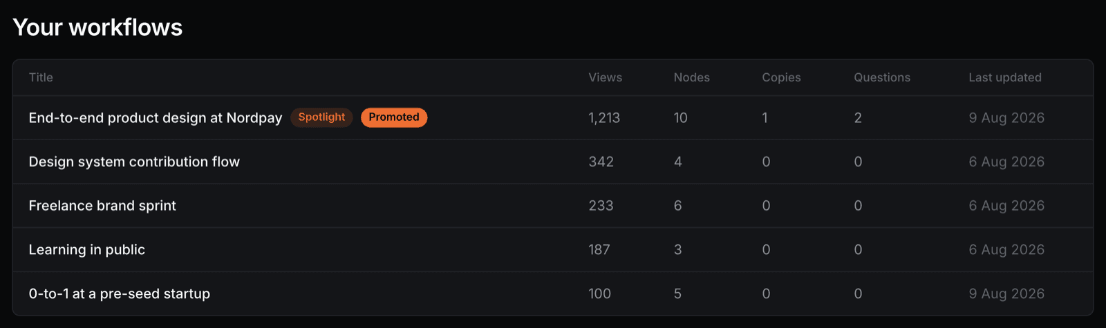
How many people took your workflow into their own account to adapt it. Live today, on your dashboard and your profile.
So you can: tell the difference between a map people admire and a map people use. One person taking your process into their own account is worth a hundred glances, which is why copies rank above views here.
Questions asked on your workflows, from named people, with your answers attached.
So you can: find the part you under-explained. A question is a gap in the map — and answering it in public turns your page into something worth returning to.
A running total plus a seven-day figure, so you can see movement rather than just a big static count.
So you can: settle the “does anyone actually care about my process” argument with a number instead of a guess.
A time series rather than a running total. The data is already recorded; there's no creator-facing chart for it yet.
So you can: see whether a post, a talk or a newsletter mention actually moved anything — and which one.
A per-step breakdown of what people take when they copy you. This is the number your own site and YouTube genuinely cannot give you.
So you can: learn which part of your process other people consider the good bit — the thing worth writing up, teaching, or charging for.
Views, copies and new questions across your maps, delivered rather than fetched.
So you can: stop having to remember to check. The point of these numbers is that they reach you, not that you go looking.
Publish the version that's true, not the tidy one.
Pick one thing you did this month. Ten minutes of nodes, ten of reasoning. That's a map, and it's already more than almost anyone else has published.